
After implementing the document creation feature, the next step in this tutorial is to add a side navigation menu that will list all documents.
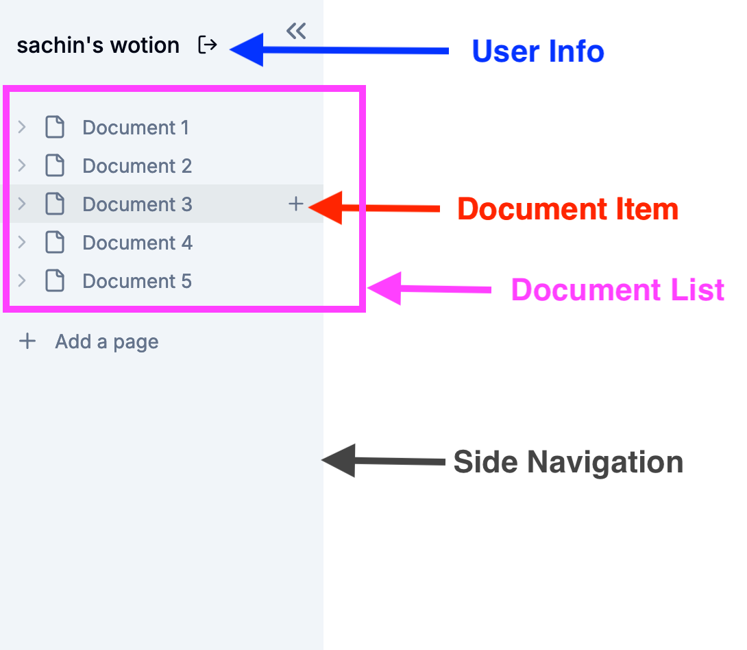
The side navigation, as illustrated in the image below, will be organized into three main sections:
- User Info: This section will display the username and provide a logout option.
- Document Item: Each document item will display the document name and include an option to add a new child page.
- Document List: This section will display all the document items.
User Info
Let's begin by creating a section in the side navigation that displays the username and includes a logout option (for now, we’ll only display the logout icon. The functionality will be implemented in a future tutorial).
Create a user-info.tsx file in the app/(main)/_components directory.
'use client'
import { useAuthenticator } from '@aws-amplify/ui-react'
import { Button } from '@/components/ui/button'
import { LogOut } from 'lucide-react'
export const UserInfo = () => {
const { user, signOut } = useAuthenticator((context) => [context.user])
return (
<div className="mb-3 p-4 items-center flex">
<p className="font-medium truncate">{user.username}'s wotion</p>
<Button
onClick={signOut}
variant="ghost"
size="sm"
className="right-5"
aria-label="logout"
>
<LogOut className="h-4 w-4" />
</Button>
</div>
)
}
export default UserInfo
Document Item
The document item will display the document name and include an option to add a new child page. We’ll utilize this document item in the document-list.tsx file, which is mentioned below.
Create a document-item.tsx file in the app/(main)/_components directory.
"use client";

import {
    LucideIcon,
    ChevronDown,
    ChevronRight,
    Plus,
} from "lucide-react";
import { useRouter } from "next/navigation";
import { cn } from "@/lib/utils";
import { useDocumentContext } from "@/context/document-context";
import useCreateDocument from "@/hooks/use-create-document";
import { Skeleton } from "@/components/ui/skeleton";

interface ItemProps {
    id?: string;
    documentIcon?: string;
    active?: boolean;
    expanded?: boolean;
    isSearch?: boolean;
    level?: number;
    onExpand?: () => void;
    onClick: () => void;
    label: string;
    icon: LucideIcon;
}

export const DocumentItem = ({
                         id,
                         active,
                         documentIcon,
                         isSearch,
                         level = 0,
                         onExpand,
                         expanded,
                         label,
                         onClick,
                         icon: Icon,
                     }: ItemProps) => {
    const router = useRouter();
    const { documents } = useDocumentContext();

    const document = documents.find((doc) => doc.id === id);
    let title = document ? document.title : "";

    const handleExpand = (
        event: React.MouseEvent<HTMLDivElement, MouseEvent>
    ) => {
        event.stopPropagation();
        onExpand?.();
    };

    const ChevronIcon = expanded ? ChevronDown : ChevronRight;

    const handleCreate = useCreateDocument();

    const handleCreateChildDocument = async (
        event: React.MouseEvent<HTMLDivElement, MouseEvent>
    ) => {
        event.stopPropagation();
        handleCreate(id);
    };

    return (
        <div
            onClick={onClick}
            role="button"
            style={{
                paddingLeft: level ? `${level * 12 + 12}px` : "12px",
            }}
            className={cn(
                "group min-h-[27px] text-sm py-1 pr-3 w-full hover:bg-primary/5 flex items-center text-muted-foreground fount-medium",
                active && "bg-primary/5 text-primary"
            )}
        >
            {!!id && (
                <div
                    role="button"
                    className="h-full rounded-sm hover:bg-neutral-300 mr-1"
                    onClick={handleExpand}
                >
                    <ChevronIcon className="h-4 w-4 shrink-0 text-muted-foreground/50" />
                </div>
            )}
            {documentIcon ? (
                <div className="shrink-0 text-[18px] mr-2">{documentIcon}</div>
            ) : (
                <Icon className="shrink-0 h-[18px] mr-2 text-muted-foreground" />
            )}
            <span className="truncate">{label}</span>
            {isSearch && (
                <kbd className="ml-auto pointer-events-none inline-flex h-5 select-none items-center gap-1 rounded border bg-muted px-1.5 fonto-mono text-[10px] font-medium text-muted-foreground opacity-100">
                    <span className="text-xs">⌘</span>K
                </kbd>
            )}
            {!!id && (
                <div className="ml-auto flex items-center gap-x-2">
                    <div
                        onClick={handleCreateChildDocument}
                        className="opacity-0 group-hover:opacity-100 h-full ml-auto rounded-sm hover:bg-neutral-300"
                    >
                        <Plus className="h-4 w-4 text-muted-foreground" />
                    </div>
                </div>
            )}
        </div>
    );
};

DocumentItem.Skeleton = function ItemSkeleton({ level }: { level?: number }) {
    return (
        <div
            style={{
                paddingLeft: level ? `${level * 12 + 25}px` : "12px",
            }}
            className="flex gap-x-3 py-[3px]"
        >
            <Skeleton className="h-4 w-4" />
            <Skeleton className="h-4 w-[30%]" />
        </div>
    );
};
Document List
In this component, we'll fetch all the documents using the LIST_DOCUMENTS_QUERY and incorporate the document item component that we defined earlier.
Create the document-list.tsx file in the app/(main)/_components directory.
"use client";

import { useQuery } from "@apollo/client";
import { useParams } from "next/navigation";
import { useRouter } from "next/navigation";
import { useState, useEffect } from "react";
import { DocumentItem } from "./document-item"
import { cn } from "@/lib/utils";
import { FileIcon } from "lucide-react";
import { LIST_DOCUMENTS_QUERY } from "@/app/(graphql)/queries";
import { useDocumentContext } from "@/context/document-context";

interface DocumentListProps {
    parentDocumentId?: string | null;
    level?: number;
}

export const DocumentList = ({
                                 parentDocumentId = null,
                                 level = 0,
                             }: DocumentListProps) => {
    const params = useParams();
    const router = useRouter();
    const { documents, setDocuments } = useDocumentContext();

    const [expanded, setExpanded] = useState<Record<string, boolean>>({});
    const { loading, error, data } = useQuery(LIST_DOCUMENTS_QUERY);

    useEffect(() => {
        if (data) {
            setDocuments(data.listDocuments.data);
        }
    }, [data, setDocuments]);

    const onExpand = (documentId: string) => {
        setExpanded((preExpanded) => ({
            ...preExpanded,
            [documentId]: !preExpanded[documentId],
        }));
    };

    const onRedirect = (documentId: string) => {
        router.push(`/documents/${documentId}`);
    };

    if (loading) {
        return (
            <>
                <DocumentItem.Skeleton level={level} />
                <DocumentItem.Skeleton level={level} />
                <DocumentItem.Skeleton level={level} />
            </>
        );
    }

    if (error) {
        return <p>Error loading documents</p>;
    }

    const renderDocuments = (parentDocumentId: string | null, level: number) => {
        const filteredDocuments = documents.filter((doc: any) =>
            doc.parentDocument
                ? doc.parentDocument.id === parentDocumentId
                : parentDocumentId === null
        );

        if (filteredDocuments.length === 0 && level > 0) {
            return (
                <p
                    style={{
                        paddingLeft: level ? `${level * 12 + 25}px` : undefined,
                    }}
                    className={cn("text-sm font-medium text-muted-foreground/80")}
                >
                    No Pages inside
                </p>
            );
        }

        return filteredDocuments.map((document: any) => (
            <div key={document.id}>
                <DocumentItem
                    id={document.id}
                    onClick={() => onRedirect(document.id)}
                    label={document.title || "Untitled"}
                    icon={FileIcon}
                    documentIcon={document.icon}
                    active={params.documentId === document.id}
                    level={level}
                    onExpand={() => onExpand(document.id)}
                    expanded={expanded[document.id]}
                />
                {expanded[document.id] && (
                    <DocumentList parentDocumentId={document.id} level={level + 1} />
                )}
            </div>
        ));
    };

    return <>{renderDocuments(parentDocumentId, level)}</>;
};
Side Navigation
With all the components for the side navigation in place, let's integrate them into our side navigation.
Update the app/(main)/_components/navigation.tsx file with the following content.
'use client'
import { ElementRef, useRef, useState } from 'react'
import { useParams } from 'next/navigation'
import {
    ChevronsLeft,
    MenuIcon,
    Plus
} from 'lucide-react'

import { cn } from '@/lib/utils'

import UserInfo from './user-info'
import { DocumentItem } from './document-item'
import { DocumentList } from './document-list'
import useCreateDocument from '@/hooks/use-create-document'

const Navigation = () => {
    const params = useParams()
    const handleCreateDocument = useCreateDocument()
    const sidebarRef = useRef<ElementRef<'aside'>>(null)
    const navbarRef = useRef<ElementRef<'div'>>(null)
    const [isResetting, setIsResetting] = useState(false)
    const [isCollapsed, setIsCollapsed] = useState(false)

    const resetWidth = () => {
        if (sidebarRef.current && navbarRef.current) {
            setIsCollapsed(false)
            setIsResetting(true)

            sidebarRef.current.style.width = '240px'

            navbarRef.current.style.setProperty('width', 'cacl(100% - 240px')
            navbarRef.current.style.setProperty('left', '240px')

            setTimeout(() => setIsResetting(false), 300)
        }
    }

    const collapse = () => {
        if (sidebarRef.current && navbarRef.current) {
            setIsCollapsed(true)
            setIsResetting(true)
            sidebarRef.current.style.width = '0'
            navbarRef.current.style.setProperty('width', '100%')
            navbarRef.current.style.setProperty('left', '0')

            setTimeout(() => setIsResetting(false), 300)
        }
    }

    return (
        <>
            <aside
                ref={sidebarRef}
                className={cn(
                    'group/sidebar h-full bg-secondary overflow-y-auto relative flex w-60 flex-col z-[99999]',
                    isResetting && 'transition-all ease-in-out duration-300'
                )}
            >
                <div
                    onClick={collapse}
                    role="button"
                    className="h-6 w-6 text-muted-foreground rounded-sm hover:bg-neutral-300 absolute top-3 right-2 opacity-0
          group-hover/sidebar:opacity-100 transition"
                >
                    <ChevronsLeft className="h-6 w-6" />
                </div>
                <div>
                    <UserInfo />
                </div>
                <div>
                    <DocumentList />
                    <div className="py-4">
                        <DocumentItem
                            onClick={() => handleCreateDocument(null)}
                            label="Add a page"
                            icon={Plus}
                        />
                    </div>
                </div>
            </aside>
            <div
                ref={navbarRef}
                className={cn(
                    'absolute top-0 z-[99999] left-60 w-[calc(100%-240px)]',
                    isResetting && 'transition-all ease-in-out duration-300'
                )}
            >
                <nav className="bg-transparent px-3 py-2 w-full">
                    {isCollapsed && (
                        <MenuIcon
                            onClick={resetWidth}
                            role="button"
                            className="h-6 w-6 text-muted-foreground"
                        />
                    )}
                </nav>
            </div>
        </>
    )
}

export default Navigation
Now, let's run the application, and you should see the side navigation in action.
Next Step! Part 6 - Document Navigation and Update Document
We’ve implemented a side navigation menu that lists all documents. In the next tutorial, we'll add Document Navigation and the ability to update a document. Stay tuned for the next part of this blog series!
If you have any questions or feedback related to this tutorial, please feel free to reach out to us on the Community Slack!
This article was written by a contributor to the Write with Webiny program. Would you like to write a technical article like this and get paid to do so? Check out the Write with Webiny GitHub repo.
